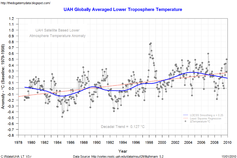
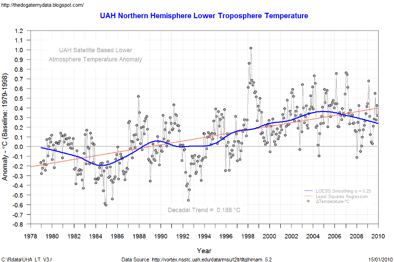
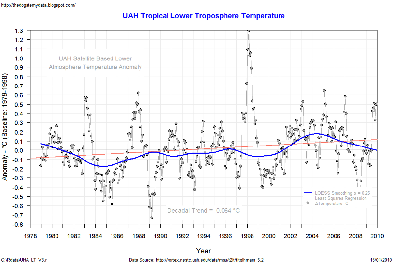
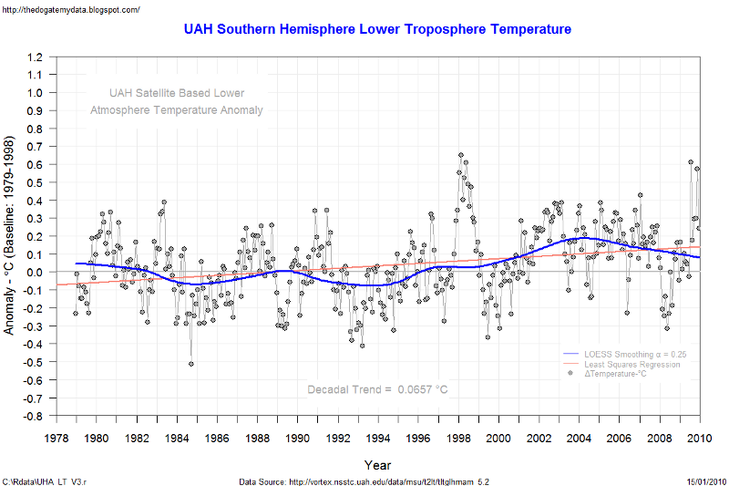
Continuing with data plots using "R" I have written a program to automatically download the latest satellite temperature data from UAH, perform some statistical analysis and plot the results. The output follows.
Note that the red linear trend line is fitted for illustrative purposes only as a straight line plot is a very poor representation of the variability of the data (R2 coefficient is very low). The fitted least squares straight line regression is used to calculate the decadal trend in the temperature anomaly only to enable us to make comparisons between the various areas plotted.
As expected it is immediately obvious that the temperature anomaly is greatest in the northern hemisphere and much less in the tropics and southern hemisphere. Also noted is that the variability of the temperature data is greatest in the tropics. The temperature globally and in all regions plotted has been trending down since at least 1998.
The blue line is LOESS smoothing with q = 0.25.
Further analysis will follow as we develop this series.
If you would like the actual R code that I wrote to produce these graphs please feel free to ask and I will email it to you.


No comments:
Post a Comment